So having fetched my A4 prints yesterday, I was a bit disappointed to find that they are not as I expected. The bright , vibrant colours that I wanted are quite a bit darker. I hope that the photobook reflects what I think I sent them!
So having fetched my A4 prints yesterday, I was a bit disappointed to find that they are not as I expected. The bright , vibrant colours that I wanted are quite a bit darker. I hope that the photobook reflects what I think I sent them!
To decide which images were going to make the final cut, I went through them all on screen and picked out the possibilities. I found some that, as they were, were not good enough, but I spotted a good crop that I could use. I ended up with about 30 to choose from, and I knew I needed about 20. Some I was able to discard straight away as I could clearly see that they were not of the standard I was looking for. I printed out the possibilities, just on an inkjet printer and normal paper, and spread them out on a table so I could see exactly what I had.


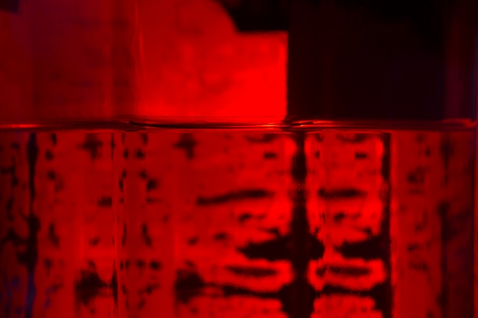
These three were discarded because, aside from anything else, I had already decided to go with abstract images, and not include any labels. The Gordon’s image is not vibrant enough, but is one of the ones where I saw a possible second image within in, and cropped it to the bottom right hand corner. This image is shown below. The colour in the London Dry image is very vivid, and you can’t see much of the label, but the top of the cork is bland and doesn’t add anything the image. I couldn’t see a different crop in it, so it went. I love the colour of the Brecon image, but I have plenty of other images that are just as bright but much more interesting than just a label and a splash of red.


These two also did not make the final cut. Again, the colour is striking, and is a good contrast against the black, but I deemed them not creative enough to be included.


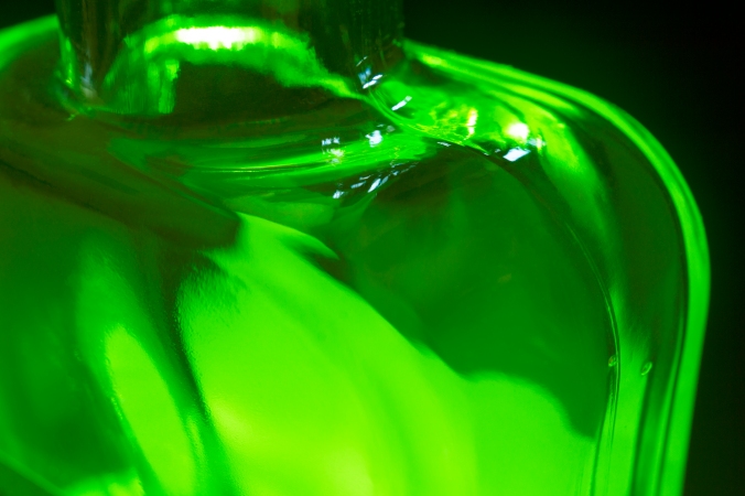
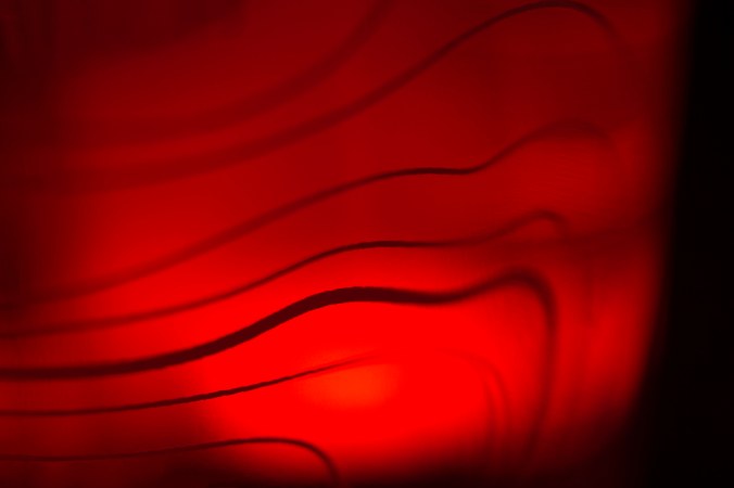
These two were rejected as well. I saw a second image within the green one that I cropped to (below) though. The colour is right but the view isn’t as abstract as I was looking for. The red one, again, is a good colour, but the words are not clear enough and the triangle point gets lost in the shadow behind it.


I love the colour in these two, but they were discarded. The one on the left was rejected because the plants are blurred due to the distortion from the liquid. The one on the right was not included because I feel it would have been a better image if the leaves in the background were clearer. A greater depth of field might have made it a better image.


Thinking about the layout of my book, as I had decided on the theme of RGB I wanted to display the images in the order RGB, RGB, RGB…. so I needed an equal number of red, green and blue images. I whittled it down to 24 images, but then realised that I had a few that were quite similar. To avoid repetition, I decided to take out these three. I had to take out one of each colour to stay with the layout that I wanted. It was a difficult decision as I think that they are good images. They are vivid, interesting and abstract, but sometimes less is more. But….I then realised that with 21 images, I would have the final one sat on its own at the back of the book without a partner, so I reinstated the red one to make a final count of 22, and to stay with the format of RGB that I had decided upon.
So, on to the ones that I decided to keep! I have displayed them below in the order that they appear in my book. Work was carried out on all of them in Photoshop so that the colour balance is consistent, and many bubbles, scratches and imperfections in the glass were removed. I have included three samples of the post production work within the selection below, as comparison to the final image.


This is one of two attempts at this image. The other attempt is where I pulled the camera back to include the whole of the circle at the top within the frame. After discussion with my fellow students, it was deemed that this is the better of the two. The depth of field is narrow so we cannot see the contour lines on the other side of the bottle with any clarity, and the word “hardd” (which means “beautiful” in Welsh) is highlighted. There was some discussion in class about whether images with text in them should be used, but I think that this is a well balanced image that is complimented by the inclusion of the word, especially so now that I know what the translation is.
You can see the work that I have carried out on this image, removing various bubbles and faults in the glass and tweaking the colour and contrast slightly.


Again, a few attempts were made on this image, using different depths of field and focal points. I have included here the ‘before’ image for comparison. The bottle contains many bubbles and flaws, which are not conducive to high quality macro photography! I also made sure that the colour balance was correct. I chose this one because it really is abstract; unless you know, it is unlikely that you would guess that the ‘sun’ is a distorted label seen through glass and liquid. It contains some interesting shapes, and the colour is vibrant. I put it on the next page to the ‘hardd’ image as the circular shapes reflect one another

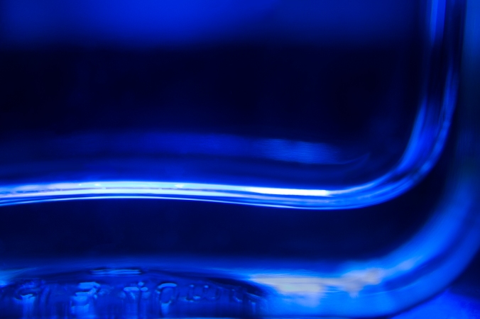
The zigzag pattern on the left nicely reflect the different zigzag patterns on the right of this image, and that and the different shades of blue give it a 3D feel. Looking at the pattern on the right, this could almost be ripples of water in a deep blue lagoon. This was the only one of this image that I photographed, as I could see that the depth of field and composition was correct.

I was told that this looks like a Star Wars Tie Fighter; I guess it does! I love the clean lines and the little bit of highlight on the surface of the liquid, and the colour jumps out of the image. I put this next to the blue image above in my book, as they are both portrait orientation (only four out of these 21 images are this way up).
Although we can clearly see that this is a bottle, and so isn’t quite as abstract as some of the others, I find the lines of the shoulder and the smooth glass appealing. It looks very tactile, and these are the reasons why it made the final cut.

As with the green image above, this looks tactile and the smooth lines are appealing. The serial number that is stamped on the underside of the bottle was quite bright in the raw image and was distracting, so I muted this slightly in Photoshop. This is placed next tot he green image above in the book, because of their similarity. They also show the top and the bottom of the bottle, so it makes sense that they match up.
You can see that I have taken out a number of bubbles and bits of dust, and have also toned down the highlights on the serial code that is stamped on the bottom of the bottle, which was distracting.
The glue and the label on the other side of this bottle create some interesting patterns, which have been magnified by the liquid. The surface of the liquid itself has some nice stripes running through it, and acts as a division between the pattern at the bottom of the image and the relative emptiness at the top.

A similar image to the red one above, hence placing them together in the book, but this one has more dimension to it. I find the curve of the surface of the liquid appealing, and the patterns of the glue on the back of the label are interesting; almost like a Rorschach test!

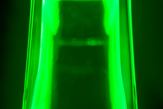
This image is very simple and elegant, with clean lines and just a bit of added interest with the two logos in the corner. A shallow depth of field has left the back of the bottle almost completely out of focus, creating a nice background to the main focus of the image; the contours.
A similar image to the one above, hence placing them next to each other in the book, but this one has a shallower still depth of field so that only a portion of the contours are in focus, and those on the back of the bottle are not visible at all. I like the frame around the left side and the bottom of the image, with the red getting brighter and brighter towards the centre bottom.
Another appreciation of clean lines and vibrant colour here, and the colour jumps out of the sides of the bottle into the background, creating a halo effect.

I placed this next to the green one above in the book as they both show lines going across the image; in the top one from top to bottom, and in this one from left to right. I appreciate the simplicity of this. It is a picture of the bottom of the bottle, but does look like the liquid that it holds. The two highlights could almost be a splash of liquid bouncing back up from the surface, with the ripples emanating outwards from the point of impact.

This is another appreciation of smooth, clean, crisp lines, and the feeling of tactility. The top of the label on the other side of the bottle gives the image a base to sit on, although the sides of the bottle flow down either side of it, while the neck reaches up and out of the image.

A similar but different view of this bottle to the image above, the shoulders are in focus but the intensity of the light bouncing around the inside of it makes it look out of focus. The neck of the bottle is deliberately out of focus; I took a few of these images, some at F22 and some at F8 to try out different depths of field. This one at F8 is the best.

The beautiful patterns in this abstract of the shoulder of one of the bottles remind me of swirling water.

This has a 3D feel due to the positioning of the stripes. It was deliberately taken at an angle (see background on the right) to tie in with the angles in the pattern. The colour is rich and intense.

This is quite different from all the others, which is why I included it. It is a slow shutter image of the bubbles swirling around in the liquid after the bottle was shaken. I have blogged about it before, but this image has had a little work done to it since then. There were some light spots that were distracting, and the colour has been manipulated to harmonise with the rest of the greens in the series.

Another example of the stunning patterns created by this bottle, the pattern on the left reminds me of the sea coming up a beach.
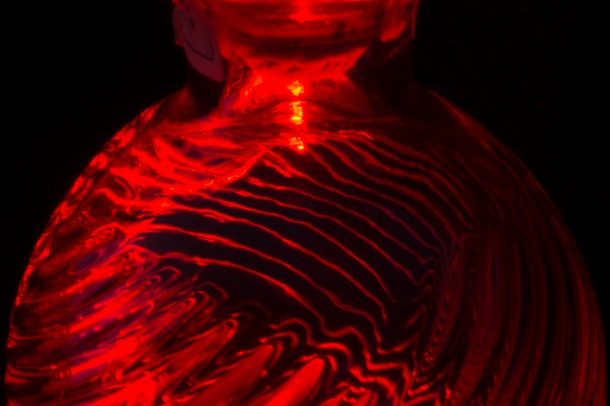
This image makes me think of blood flowing around the body, with the part in the middle being the heart.
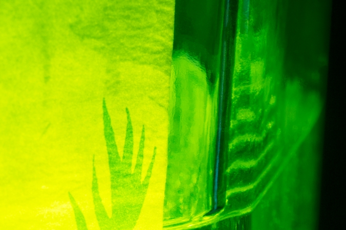
As mentioned above, this image was taken as a crop from a larger image of a Gordon’s bottle. I like that the reflection of the surface of the water is repeated to make stripes up the glass, and that this incorporates a vivid yellow as well as some of the black background.

This is the penultimate image in the series, the highlight within which again reminds me of a beating heart in someone’s body. The curvature of the shoulder leading up into the neck is also human like. Again, it has smooth lines and is another tactile type of image.

As noted earlier, this image was reinstated from the reject pile to pair with the image above, which it does very well. Similarly, the smooth lines and the curve on the shoulder give it a tactile feeling, and the depth of colour makes it striking.
To put the book together I used Blurb (other publishing companies are available!) purely because I have used them before and am familiar with their templates, and I know that they are reliable. I chose to place the images onto black pages instead of the standard white, as they are so much more striking on black. Some of the images have a lot of black in them so, to prevent the image bleeding into the page, I chose to surround them with a fine white line. I have not seen the book yet, but I think that this will work well. I chose a 30x30cm hardback; the square shape because there are landscape and portrait oriented images, and hardback to make sure it has as long a life a possible!
